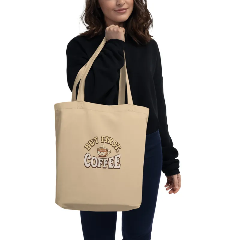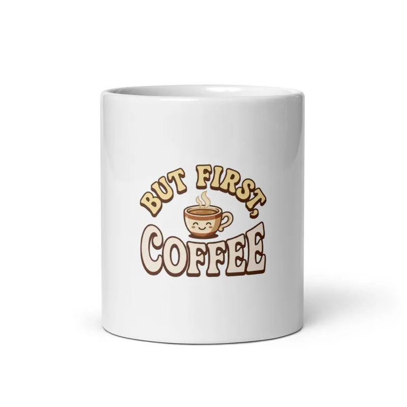
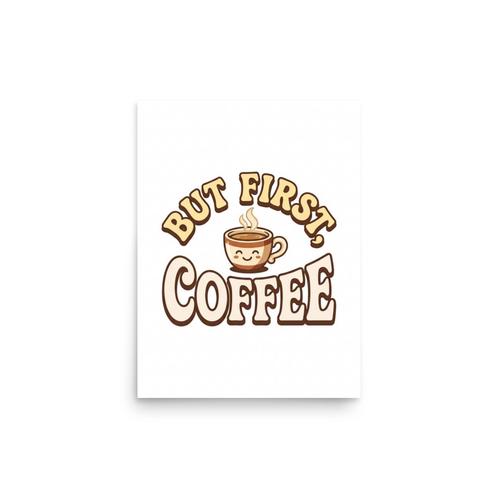
But First, Coffee Art Print, bold retro typography, kitchen wall decor, coffee lover gift, playful home office art
Bring a warm, playful start to your space with this But First, Coffee art print, featuring bold retro typography, a cute coffee-themed illustration, and friendly colors on a clean white background. Digitally printed on Enhanced Matte Paper (189 g/m²), it suits kitchen walls, coffee corners, home offices, or makes a cheerful gift for caffeine lovers.
The eye meets the words first: “But First, Coffee” is arranged in large, rounded retro lettering that gives the composition an immediate, easy-to-read rhythm. The forms feel hand-drawn rather than formal, with soft curves, sturdy strokes, and a playful balance between the text and the small coffee motif nearby. Warm cream, caramel, muted red, and deep brown create a palette that feels at home beside wood, tile, and brushed metal, while the clean white ground keeps the design open and uncluttered. The illustration adds a friendly point of character without competing with the message, using simple shapes and clear outlines that remain readable from across a room. Together, the lettering, image, and generous white space make a compact visual statement suited to a place where the day begins.
Its visual language belongs to the mid-century diner and kitchen-sign tradition, when cheerful lettering, limited palettes, and direct phrases were used to make everyday spaces feel welcoming. One concrete marker of that style is the use of rounded display type with slightly exaggerated curves, similar to the bold sign lettering seen on coffee counters, roadside cafés, and 1950s-inspired kitchen décor. The design also draws on the poster habit of treating a short phrase as the main image: rather than surrounding the message with detailed scenery, it gives the words room to carry the humor. That approach fits the Relatable Lifestyle Humor series, turning a familiar morning thought into a piece of visual conversation. It can sit alongside a collection of recipe prints, fruit illustrations, café signs, or other small reminders of daily routines without needing a matching frame or a fully themed room.
Place it where the first cup is made or the first screen is opened: above a coffee station, beside open kitchen shelving, near a breakfast table, or on the wall behind a home-office desk. The white background works especially well against pale sage, butter yellow, dusty blue, terracotta, warm grey, or natural wood, while the darker lettering gives the arrangement enough definition on a light wall. In morning light, the warm tones can echo the colour of a wooden worktop or ceramic mug; under a pendant lamp or a softer desk light, the simple layout stays clear without feeling busy. A narrow wall beside the pantry, a small nook near the kettle, or a pinboard area in a study can give it a natural home. It also makes a lighthearted choice for someone who keeps a mug by the keyboard, starts weekends slowly, or treats the kitchen as the most sociable room in the house.
| Material | Enhanced Matte Paper (189 g/m²) |
| Digital printing | |
| Care | Frame or mount out of direct sunlight; wipe gently with a dry, soft cloth. |
| Shipping | Made to order — ships in 2–5 business days |