Sarcasm Loading T-Shirt, retro graphic tee, casual everyday wear, humorous gift for sarcastic friends, unisex cotton style
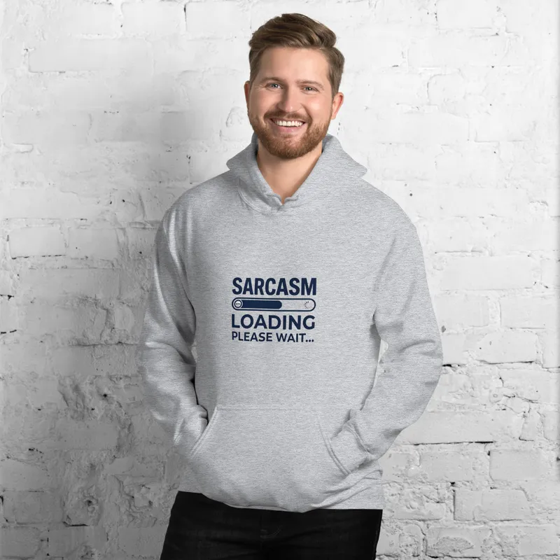
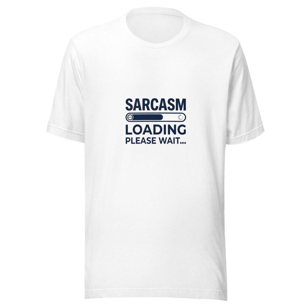
“Sarcasm Loading, Please Wait” appears in a bold retro-style font across this playful unisex tee, giving the classic casual silhouette a witty graphic finish. Made from 100% combed and ring-spun cotton, it brings a soft feel to everyday outfits and makes a humorous gift for friends who enjoy clever, sarcastic style.
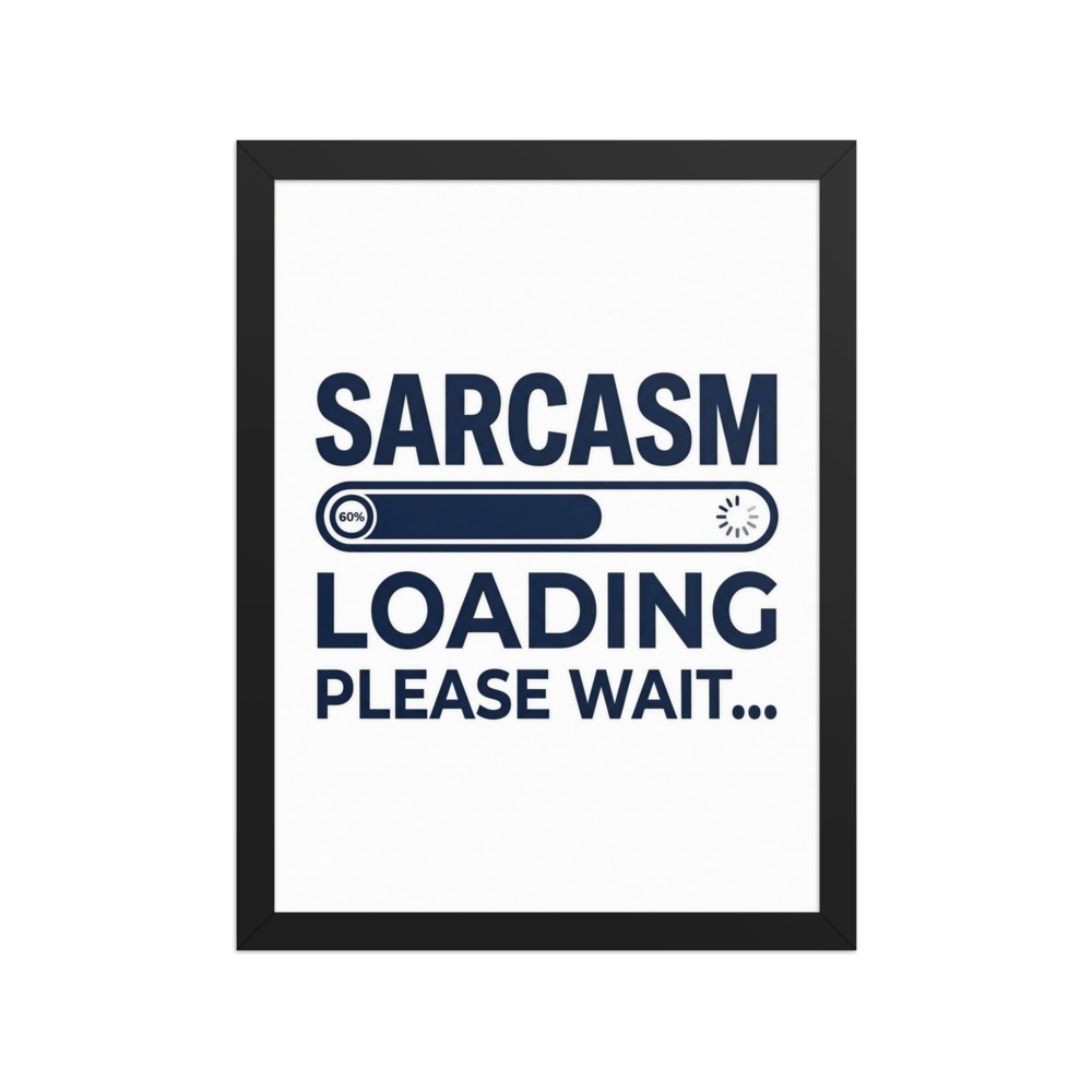
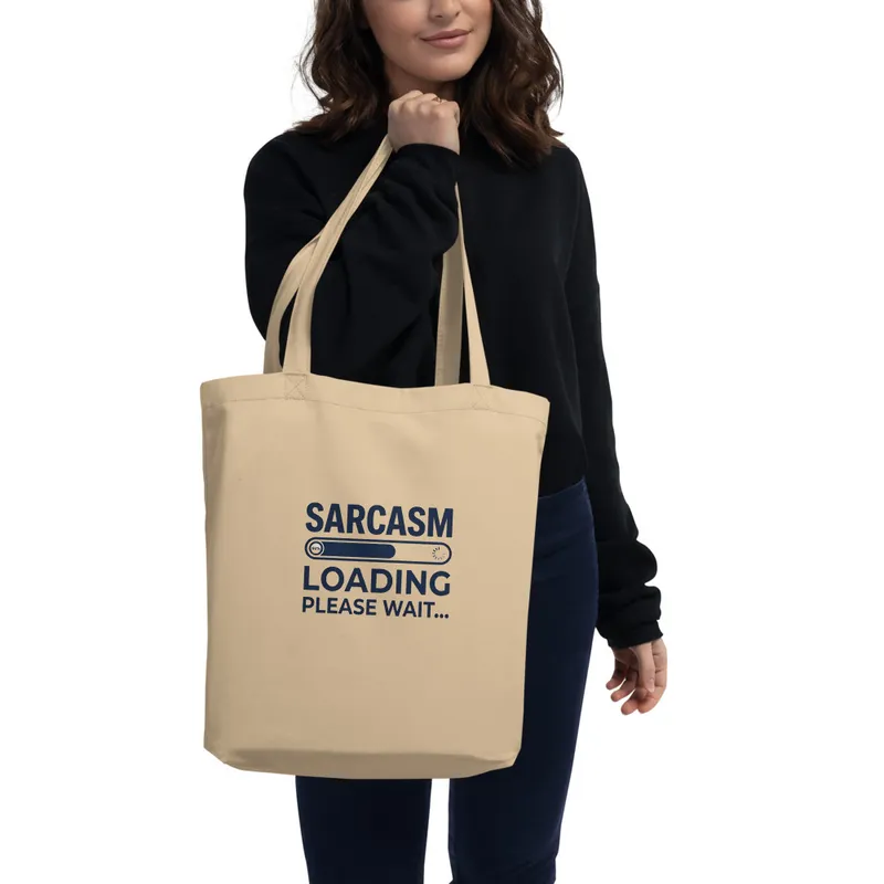
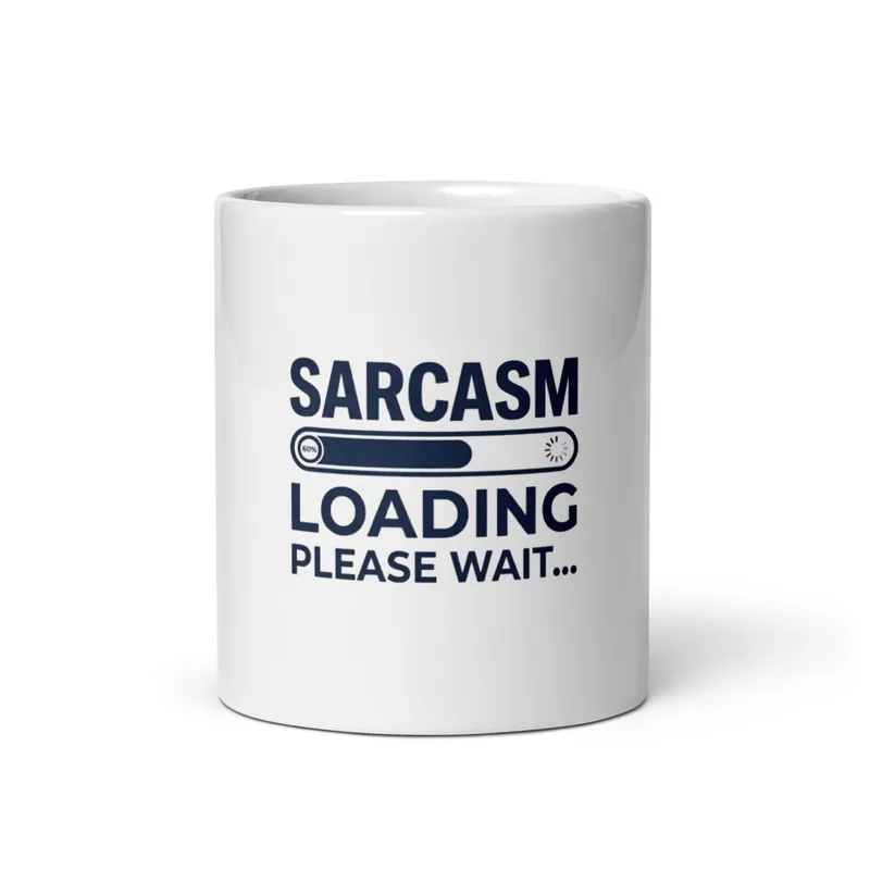
The eye meets a compact typographic composition built around the phrase “Sarcasm Loading, Please Wait.” The lettering is the main image: bold, retro-styled forms arranged across the front, with the words doing the work of both message and shape. Rather than relying on characters, scenery or decorative illustration, the design uses the rhythm of a short sentence, the weight of the type and the spacing between lines to create its visual presence. The palette stays tied to the contrast between the garment and the printed lettering, keeping attention on the words instead of introducing a crowded range of colours. Its line quality is clean and graphic, with strong edges suited to a casual everyday look. The result has the directness of a sign, label or screen-printed slogan, but the wording shifts that familiar format into dry humour. Seen from across a room, the phrase reads as one clear block; closer up, the pauses in “Loading” and “Please Wait” give the composition its comic timing.
This belongs to the broad retro graphic tradition that turns ordinary lettering into a visual object. A concrete marker is the bold display font: it is designed to be noticed quickly, with substantial letterforms rather than delicate text or a modern, minimal wordmark. That approach recalls the printed language of old shop signs, diner menus, service notices and other everyday graphics where a few large words had to communicate at a glance. Here, the familiar instruction to wait is treated as a punchline. “Sarcasm Loading” suggests a progress bar or delayed response, while “Please Wait” completes the mock-official message. The humour comes from placing a conversational attitude inside a format associated with instructions and status updates. That combination makes the artwork easy to read without making it visually plain. The composition works for someone who likes vintage-inspired lettering, understated jokes and graphics that can be understood before the full sentence has even been taken in.
On a wall, the design wants a place where text can be read without competing with a dense gallery of images: above a desk, beside a bookshelf, near a hallway mirror or in a casual living-room arrangement. It suits a room with practical furniture, simple surfaces and a little space around the artwork, allowing the bold lettering to function as the focal point. The best light is even, natural daylight or a soft indoor lamp aimed from the front, so the words remain legible and the contrast between fabric and print is not broken by deep shadows. A bright window can give the graphic a crisp daytime presence, while warmer evening light makes the joke feel more like a personal sign than formal decoration. Because the artwork is built from type rather than fine detail, it does not need a close viewing distance; it can be understood from a doorway, then appreciated more closely for its lettering and spacing. It brings a dry, playful note to a home office, bedroom, entryway or any corner reserved for everyday humour.
| Material | 100% combed and ring-spun cotton (Heather colors contain polyester) |
| DTG printing | |
| Care | Machine wash cold inside-out, tumble dry low, do not iron directly on the design. |
| Shipping | Made to order — ships in 2–5 business days |